Monday, September 23, 2013

Welcome Fall


Kya at the pumpkin patch last year. Can't resist those knuckle-heads.


Welcome Fall.

Friday, September 20, 2013

Have a Glamourous Weekend


It was a week......oh, what a crazy week.
I needed four more of me to deal with the days.


There were moments I thought I might loose my mind........ and it would have been a good thing.


An extra pair of hands would have been great.

I liked to say it was because of the full moon, but the whirlwind week was caused by a bug. 
Not the kind you can get rid of with a can of toxic spray, but the kind that injects itself into your family. 
The constant sound of coughing might have been heard if everyone's ears did not feel as if they may explode. 


Mr. I'm-sick-for-a-day-and-then-have-the-superman-cape-back-on, has been barking for an entire week. 
I'm pretty certain that wrestling my Granddaughter to take her medicine will likely not win me Grandmother of the year awards.
While my Daughter wove in and out of trying to work and give attention to her sick child while fighting off the bug.

And it's been chasing me.....but I'm determined to not let the little bugger win.


I'm thinking that the only thing on the menu this weekend should be a manicure.

And you?


Here's hoping that your weekend is carefree and Glamourous.


Monday, September 16, 2013

Shades of Spring and Summer

Albeit that we have not yet put our Fall sweaters on, the fashion industry is well ahead of the game and already have Spring & Summer 2014 ready for our shopping bags. The truth is that in the world of fashion, designers are many seasons ahead of what is being revealed on the runway.

The recent Fashion Week unveiled the styles, fabrics and colours that will dominate our wardrobes next spring. It is my observation of every fashion week that the net is thrown wide from most fashion houses with the attempt to capture some of the attention. For Spring 2014, the colour palette is varied and offers something for every taste.


Pantone.com describes Spring 2014 colour influences as 'A Season of Colorful Equilibrium'. Equilibrium .... like the equal balance between powers? Well certainly if that is the case, then the upcoming spring colour choices will provide the opportunity for experimentation of new looks and colour combinations {as stated by Leatrice Eiseman of Pantone Color Institute}. The palettes couldn't be any more removed from one another if they tried and yet they will all play the in proverbial summer sandbox quite well together.

Early spring offers the opportunity to play in natures sandbox with neutral tones that will allow wearers to transition easily from the dark hues of winter into the soft romantic tones of summer. Typical of spring it begins with playful names like : Khaki, Sand, Honey, Grey. The sames shades that play in deeper tones during the winter months, but we bring them to life in the spring with more subtle renditions in softer fabrics.

via


Warm tones bring the heat into the spring and summer scene for 2014 with a vibrancy that helps the season sizzle. The palette runs from the bright golden tones up the scale to hot pinks and sexy shades of red. This spring you will get familiar with colourful names like : Canary, Watermelon, Cherry, Red Orange and Crimson.

via

Summer wouldn't be complete without the colours of the ocean washing into our fashion closet. Spring 2014 will be no different and she offers a splash of tones that are sure to keep you cool. Cool tones for Spring 2014 include shades with names that bring the Caribbean waters to your doorstep : Lemon and Lime {think of those cool summer bevy's}, Aqua, Emerald, Cerulean.

via

The colour palette that is getting most of my attention are the Soft Tones. Yes, I'm a romantic and can't resist the soft ice-cream-parlor shades that make everything quite simply 'pretty'. Soft shades of pink, blue, mauve, yellow, make even the most casual of fashions look special. There is something striking when a soft tone is presented in a strong fabric - think petal pink wool jacket {ok, of course I'm thinking Chanel}. But it is in spring and summer that we get to play in not only soft tones but floaty, soft fabrics. The romance of the season is played out when shades of Watermelon, Sorbet, Peach, Lavender, Seafoam, and Powder are wistfully presented.

via
Possibly one of the reasons I love the soft shades so much is because it reminds me of Laduree. How deliciously sweet the spring season will be. 


Oscar de la Renta - Spring 2014

Oscar de la Renta
Oscar de la Renta
Burberry - Honey skirt & jacket, powder blouse
Burberry - Lavender and Pink

Burberry - Sorbet and Buttercream

The autumn leaves have yet to fall, but with a palette as pretty as this I am ready for spring to bloom.


Sunday, September 15, 2013

Cardinal House : Our Logo


Although it's not unusual to have a name for a property because of something specific to the property or the family, it is maybe a bit more rare to have a logo for the property. We have special reasons to name our new home and thought it would be fun to incorporate it into our stationery and some household items. I don't want to decorate our new home with pictures or kitschy items of Cardinals, but do want to have a small representation of the bird in a very subtle way.

I wanted a logo design that was subtle, meaningful and didn't have a commercial feel to it. I looked at various images and logo design company's to bring to life the idea we had in mind. After a broad search I found Little Guy Logo's.

ONE
TWO

THREE


FOUR

Little Guy Logo's offers various packages at reasonable rates. They designed three logo's for Cardinal House and have since produced them in various colours and formats. I plan to use subtle tone-on-tone shades for the linen embroidery and an embossed process for small note cards.

Now I'm on the search for the stationery and French linen aprons for embroidery. If anyone knows of a great contact for either please let me know.

And your thoughts on the logo designs - What is your favourite?


Thursday, September 12, 2013

Red Lacquer Soles


My Daughter treated me to a high-heeled trip downtown to the Christian Louboutin exhibit which is in Toronto until September 15th. The show-stopping creations of iconic French designer of footwear were highlighted to display the theatrical spirit of Louboutin.

The sky-high heels are displayed on a playful carousel that twirls around tempting you to touch {but you dare not}. A room size red lacquer run-way mimics the sole of a shoe providing the perfect stage for the famous creations. A hologram featuring Dita von Tesse brings the allure of wearing sexy heels to the top of the stage at the heel, while a red tufted seating area is snuggled in the toe.
This is just a portion of the enormously creative exhibit that kept us captivated and drooling. Here are some of my favourites from the event..........

Louboutin exhibit entrance - The Carousel inside twirls creations temptingly.

Sexy showgirl shoes line the sole stage


My Daughter's favourite.


Lace Louboutin - one of my favourites

Hologram of Dita von Teese plays at the top of the sole stage.


Artistic display of wood shoe forms in every size.

Cinderella Design : 'One shoe can change your life.'
The Pensee {Pansie} Series is what started the red sole revolution.

My Daughter recently gifted me with the Christian Louboutin book that outlines his 'twenty year's of design'.  The book itself is a work of art that features a pop-up and five-piece fold out in addition to the story of Louboutin's career. I already have a spot for it on the new coffee table in the living room when Cardinal House is complete.

Kicking up her heels - The inside front jacket of the Christian Louboutin book.


I'm not sure if the exhibit is heading to another city, details of further tour dates was non-existent. If it does point a well heeled toe near you, be sure to visit.


Thursday, September 5, 2013

The price of a Gentleman


When I announce to my Granddaughter that we have to go to the bank she gets excited.
You see, the bakery is right across the street from the bank.


We wander into the bakery and every time Kya captures the attention of the ladies behind the counter with her usual request.....
'Umm, excuse me lady. Can I please have a Gentleman'.

The girls chuckle and package up a gentleman - a'ka a Gingerbread cookie, in a little brown bakery bag.


The truth is Kya would rather have one of these colourful cookies, and occasionally Grandma breaks down and buys the iced sugar cookie. The iced cookies may look like fun, but the gentleman cookie is her favourite cookie.


Price of a Gentleman = $1.75. 
 When I hear Kya chirp out her request each time,
the value of a Gentleman is Priceless.


Wednesday, September 4, 2013

Cardinal House : Not Everything Is Pretty

 Warning ............... this posting isn't pretty.


Anyone who has been through a renovation will attest to the fact that it gets really ugly before it gets pretty. Let's just say we aren't sitting too pretty right now at Cardinal House. The house had been half torn apart for months while we waited for the approval to build, once that stamped paper came our way Richard lined up the crow bars and well, things got really ugly.

blue bins in the powder room area with the kitchen area beyond

While waiting for our building approvals we got familiar with the space and adjusted some of the details. I never imagined that we would be ripping out every wall, ceiling and insulation - but we had 80% of it out and it makes sense to us that it is all the same level.

We hired the Mike Holmes Home Inspection group to do our inspection. It was a great experience. The inspection is a bit more cost than some others, but it was incredibly thorough. Our inspector was a firefighter and he gave us great advise on several area's of the new build and in particular the fireplaces we are putting in.

There were still surprises that no inspector could have caught - like finding out when we started the excavation that our garage was not underpinned. These are the types of thing that no one can forsee - not even the excavator until he started to dig.

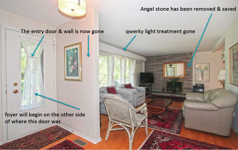
There were more obvious treasures we discovered during the inspection - like this one...........


If you are staring at this picture wondering 'what the heck is that', well let me assure you so did we at first glance. This string of Christmas lights {with the cord painted white} was stapled up under the valance in the living room. It was the home owners version of under cabinet/valance lighting. The Christmas tree cord was run down through the wall and connected to a light switch on the wall. Can we say 'fire hazard'. And to make it even more special, there were fabric valances hanging up there. It's all gone now!

Add to that a few quirky finds like the tiffany blue toilet in the downstairs powder room, albeit that it is special we will part with it. There was an odd mound of plantings with a water feature in the middle of the yard, we learned that the neighbours refer to as 'the pimple'. It's been since bulldozed away.


On the first day of the digging the excavation crew discovered that the wall under the garage is cinder block and needed to be underpinned before they proceeded.

back of the garage before digging

digging and underpinning in progress
There will be a laundry room/mudroom entry off of the garage. This area will serve as our main entry allowing us to park the car, bring in the groceries and leave our shoes and coats in the new built-in closet area. The addition will extend the dining room and kitchen further out and open into the new great room.


The house was originally three bedrooms on the main floor, but many years ago one of the bedroom's was removed. The main floor was reconfigured leaving only two bedrooms and a weird assortment of large cupboards in the middle of the front entry/hallway.
The new floor plan realigns the hallway to two bedrooms in this area, adds a powder room, creates a walk-in closet for the master bedroom, creates a master ensuite bath and expands the master bedroom. There will be an additional guest bedroom and full bath added to the lower level.

The principal bath will feature a separate water closet. 

The Angel stone around the fireplace surround was taken down and saved, we will be using it to match the same stone on the exterior during the redesign. The exterior stone and brick will be tinted a medium gray colour {more info later on Perma Tinting the exterior of the house}. Every window will be replaced with new energy efficient windows. The windows in the living room will be moved over, the fireplace will have a new face that includes a wood mantel and marble surround.


Before : it's all got to go


starting to see the light

Richard told me that once we got rolling on the project and we started opening things up I'd feel better about the process. But the day I came in and saw this I was really worried - and scared.

Two weeks ago - clearing the space completely.


 Richard and I had a play date on Saturday - picking out door nobs, handles, searching for another bathroom vanity. Before we got on the road we stopped at the house to check the progress.


And there I was on the mound of clay in flip flops and white pants. 


always wearing the wrong outfit


We did find a few things on our shopping excursion - so it's finally time to leave you with a pretty picture....... We stopped by Restoration Hardware and ordered this  lantern for the lanai area. Although it will be hanging in the vaulted ceiling area that is covered, Richard will wire the fixture for outdoor use.


19thC. Salerno Street Light

There will be more not-so-pretty things happening along the way. But I have to admit when the concrete is poured within the week, it just might be on the list of pretty.